Contributions plot
contribution_plot is a method that displays violin or scatter plot. The purpose of these representations is to understand how a feature affects a prediction.
This tutorial presents the different parameters you can use in contribution_plot to tune output.
Contents: - Classification case: Specify the target modality to display. - Sampling parameter - Focus on a subset - Violin or Scatter? Make your own choice
Data from Kaggle Titanic
[1]:
import pandas as pd
from xgboost import XGBClassifier
from sklearn.model_selection import train_test_split
Building Supervized Model
Load Titanic data
[2]:
from shapash.data.data_loader import data_loading
titanic_df, titanic_dict = data_loading('titanic')
y_df=titanic_df['Survived'].to_frame()
X_df=titanic_df[titanic_df.columns.difference(['Survived'])]
[3]:
titanic_df.head()
[3]:
| Survived | Pclass | Name | Sex | Age | SibSp | Parch | Fare | Embarked | Title | |
|---|---|---|---|---|---|---|---|---|---|---|
| PassengerId | ||||||||||
| 1 | 0 | Third class | Braund Owen Harris | male | 22.0 | 1 | 0 | 7.25 | Southampton | Mr |
| 2 | 1 | First class | Cumings John Bradley (Florence Briggs Thayer) | female | 38.0 | 1 | 0 | 71.28 | Cherbourg | Mrs |
| 3 | 1 | Third class | Heikkinen Laina | female | 26.0 | 0 | 0 | 7.92 | Southampton | Miss |
| 4 | 1 | First class | Futrelle Jacques Heath (Lily May Peel) | female | 35.0 | 1 | 0 | 53.10 | Southampton | Mrs |
| 5 | 0 | Third class | Allen William Henry | male | 35.0 | 0 | 0 | 8.05 | Southampton | Mr |
Load Titanic data
[4]:
from category_encoders import OrdinalEncoder

categorical_features = [col for col in X_df.columns if X_df[col].dtype == 'object']

encoder = OrdinalEncoder(
    cols=categorical_features,
    handle_unknown='ignore',
    return_df=True).fit(X_df)

X_df=encoder.transform(X_df)
Train / Test Split + model fitting
[5]:
Xtrain, Xtest, ytrain, ytest = train_test_split(X_df, y_df, train_size=0.75, random_state=7)
[6]:
clf = XGBClassifier(n_estimators=200,min_child_weight=2).fit(Xtrain,ytrain)
First step: You need to Declare and Compile SmartExplainer
[7]:
from shapash.explainer.smart_explainer import SmartExplainer
[8]:
response_dict = {0: 'Death', 1:' Survival'}
[9]:
xpl = SmartExplainer(model=clf,
                     preprocessing=encoder, # Optional: compile step can use inverse_transform method
                     features_dict=titanic_dict, # Optional parameters
                     label_dict=response_dict) # Optional parameters, dicts specify labels
[10]:
xpl.compile(x=Xtest)
INFO: Shap explainer type - <shap.explainers._tree.TreeExplainer object at 0x7f836390ae20>
You can now display contribution plot :
you have to specify the feature you want to analyse. You can use column name, label or column number
[11]:
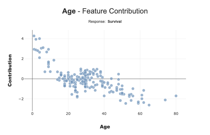
fig = xpl.plot.contribution_plot(col='Age')
fig.to_image(format="png")
[11]:
[12]:
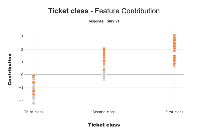
xpl.plot.contribution_plot(col='Pclass')
[12]:
Ticket Class seems to affect the prediction of the mode: Third class negatively contributes to Survival.
Classification Case: Use label parameter to select the target modality you want to focus
with label parameter, you can specify explicit label or label number
[13]:
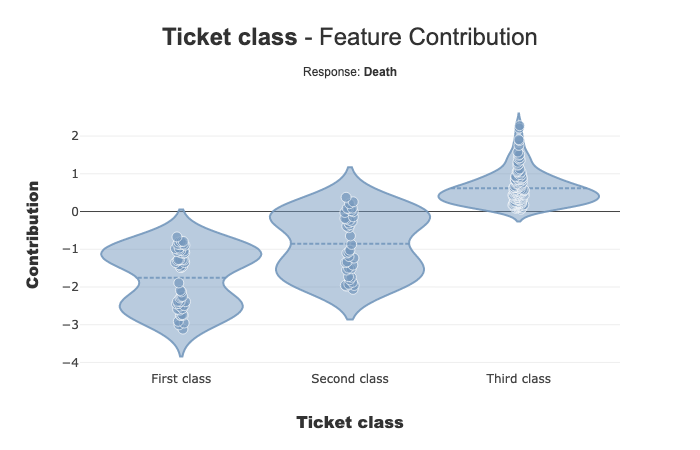
xpl.plot.contribution_plot(col='Pclass',label='Death')
[13]:
Add a prediction to better understand your model
You can add your prediction with add or compile method
[14]:
y_pred = pd.DataFrame(clf.predict(Xtest),columns=['pred'],index=Xtest.index)
xpl.add(y_pred=y_pred)
xpl.plot.contribution_plot(col='Pclass')
[14]:
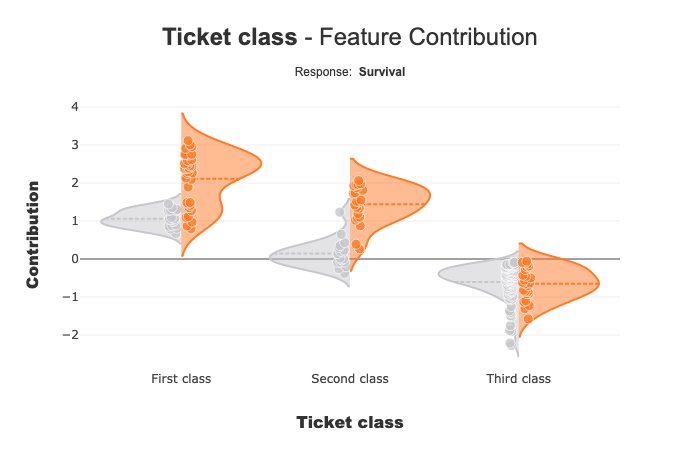
When you add predict information, you can see that the contribution of Ticket class for First class and Second class seems to be different for people with Survive prediction(orange points), compared to others (grey points). The contributions for these two ticket classes can be correlated to the value of another characteristic.
Shapash Webapp can help you to refine your understanding of the model. You can navigate between the local and the global contributions.
For Third class, the 2 distributions seem to be close.
NB: Multiclass Case - This plot displays One Vs All plot
Focus on a subset
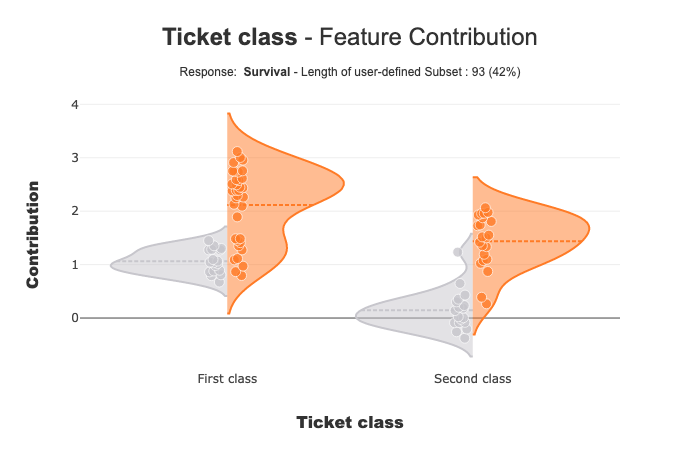
With selection params you can specify a list of index of people you wand to focus
[15]:
index = list(Xtest[xpl.x_init['Pclass'].isin(['First class','Second class'])].index.values)
xpl.plot.contribution_plot(col='Pclass',selection=index)
[15]:
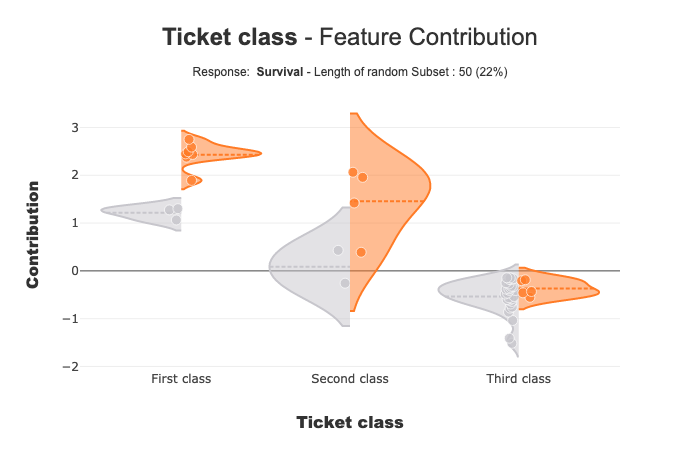
Size of Random Sample
Method contribution_plot use random sample to limit the number of points displayed. Default size of this sample is 2000, but you can change it with the parameter max_points:
[16]:
xpl.plot.contribution_plot(col='Pclass',max_points=50)
[16]:
Violin or Scatter plot?
contribution_plot displays a scatter point if the number of distinct values of the feature is greater than 10. You can change this violin_maxf parameter :
[18]:
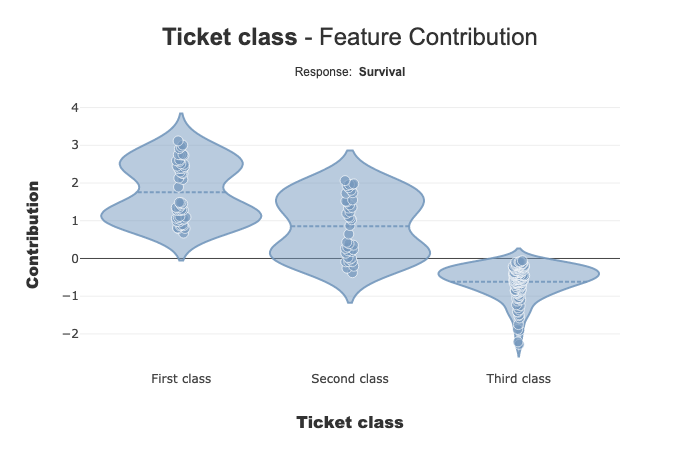
fig =xpl.plot.contribution_plot(col='Pclass',violin_maxf=2)
[18]: