
Interactions plot
Most explainability plots only allow the user to analyze one variable at a time.
Interactions plots are an interesting way to visualize a couple of variables and their corresponding contribution to the model output.
Shapash integrates two methods that allow to display such interactions for several individuals : interactions_plot and top_interactions_plot.
This tutorial presents how to use both methods to get more insights about your model and how two variables interact with it.
Content : - Loading dataset and fitting a model - Declare and compile Shapash smart explainer - Plot top interaction values - Plot a chosen couple of variables
We used Kaggle’s Titanic dataset
[1]:
import pandas as pd
from category_encoders import OrdinalEncoder
from xgboost import XGBClassifier
from sklearn.model_selection import train_test_split
Building Supervized Model
Load Titanic data
[3]:
from shapash.data.data_loader import data_loading
titanic_df, titanic_dict = data_loading('titanic')
del titanic_df['Name']
y_df=titanic_df['Survived']
X_df=titanic_df[titanic_df.columns.difference(['Survived'])]
[4]:
titanic_df.head()
[4]:
| Survived | Pclass | Sex | Age | SibSp | Parch | Fare | Embarked | Title | |
|---|---|---|---|---|---|---|---|---|---|
| PassengerId | |||||||||
| 1 | 0 | Third class | male | 22.0 | 1 | 0 | 7.25 | Southampton | Mr |
| 2 | 1 | First class | female | 38.0 | 1 | 0 | 71.28 | Cherbourg | Mrs |
| 3 | 1 | Third class | female | 26.0 | 0 | 0 | 7.92 | Southampton | Miss |
| 4 | 1 | First class | female | 35.0 | 1 | 0 | 53.10 | Southampton | Mrs |
| 5 | 0 | Third class | male | 35.0 | 0 | 0 | 8.05 | Southampton | Mr |
[5]:
from category_encoders import OrdinalEncoder

categorical_features = [col for col in X_df.columns if X_df[col].dtype == 'object']

encoder = OrdinalEncoder(
    cols=categorical_features,
    handle_unknown='ignore',
    return_df=True).fit(X_df)

X_df=encoder.transform(X_df)
Train / Test Split + model fitting
[6]:
Xtrain, Xtest, ytrain, ytest = train_test_split(X_df, y_df, train_size=0.75, random_state=7)
[7]:
clf = XGBClassifier(n_estimators=200,min_child_weight=2).fit(Xtrain,ytrain)
Declare and Compile SmartExplainer
[8]:
from shapash import SmartExplainer
[9]:
response_dict = {0: 'Death', 1:' Survival'}
[10]:
xpl = SmartExplainer(
    model=clf,
    preprocessing=encoder,      # Optional: compile step can use inverse_transform method
    features_dict=titanic_dict, # Optional parameters
    label_dict=response_dict    # Optional parameters, dicts specify labels
)
[11]:
xpl.compile(x=Xtest)
Backend: Shap TreeExplainer
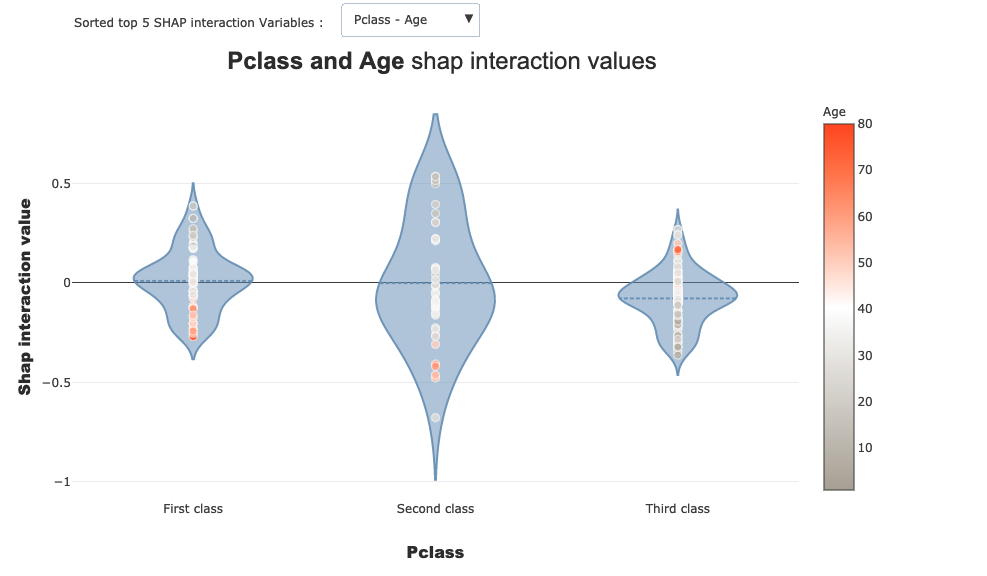
Plot top interactions
Now we may want to analyze our model and in particular how some variables combinations influence the output.
Shapash allows to quickly inspect your model by showing the variables for which there is the highest chance to get interesting interactions.
To do so you can use the following method (use the button to see the different variables interactions) :
[12]:
xpl.plot.top_interactions_plot(nb_top_interactions=5)
Plot interactions between two selected variables
If you want to display a particular couple of interactions just use the following method with the chosen features (here ‘Sex’ and ‘Pclass’):
[13]:
xpl.plot.interactions_plot('Sex', 'Pclass')
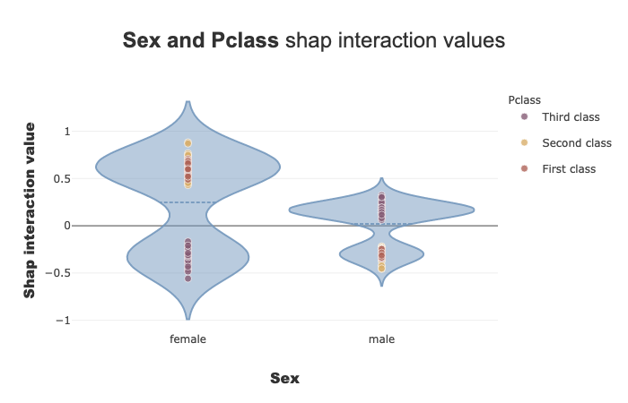
As a quick analysis we can see on the plot that the model learned the following points : - Female passengers have : - Highest chance of surviving when belonging to first or second class - Less chance of surviving when belonging to third class - On the contrary, male passengers have : - Highest chance of surviving when belonging to the third class - Less chance of surviving when belonging to first or second class