
Features importance
The methode features_importance displays a bar chart representing the sum of absolute contribution values of each feature.
This method also makes it possible to represent this sum calculated on a subset and to compare it with the total population
This short tutorial presents the different parameters you can use.
Content : - Classification case: Specify the target modality to display. - selection parameter to display a subset - max_features parameter limits the number of features
We used Kaggle’s Titanic dataset
[1]:
from sklearn.ensemble import ExtraTreesClassifier
from sklearn.model_selection import train_test_split
Building Supervized Model
Load Titanic data
[2]:
from shapash.data.data_loader import data_loading
titanic_df, titanic_dict = data_loading('titanic')
del titanic_df['Name']
y_df=titanic_df['Survived'].to_frame()
X_df=titanic_df[titanic_df.columns.difference(['Survived'])]
[3]:
titanic_df.head()
[3]:
| Survived | Pclass | Sex | Age | SibSp | Parch | Fare | Embarked | Title | |
|---|---|---|---|---|---|---|---|---|---|
| PassengerId | |||||||||
| 1 | 0 | Third class | male | 22.0 | 1 | 0 | 7.25 | Southampton | Mr |
| 2 | 1 | First class | female | 38.0 | 1 | 0 | 71.28 | Cherbourg | Mrs |
| 3 | 1 | Third class | female | 26.0 | 0 | 0 | 7.92 | Southampton | Miss |
| 4 | 1 | First class | female | 35.0 | 1 | 0 | 53.10 | Southampton | Mrs |
| 5 | 0 | Third class | male | 35.0 | 0 | 0 | 8.05 | Southampton | Mr |
Load Titanic data
[4]:
from category_encoders import OrdinalEncoder

categorical_features = [col for col in X_df.columns if X_df[col].dtype == 'object']

encoder = OrdinalEncoder(
    cols=categorical_features,
    handle_unknown='ignore',
    return_df=True).fit(X_df)

X_df=encoder.transform(X_df)
Train / Test Split + model fitting
[5]:
Xtrain, Xtest, ytrain, ytest = train_test_split(X_df, y_df, train_size=0.75, random_state=7)
[6]:
clf = ExtraTreesClassifier(n_estimators=200, random_state=79).fit(Xtrain,ytrain['Survived'])
First step: You need to Declare and Compile SmartExplainer
[7]:
from shapash import SmartExplainer
[8]:
response_dict = {0: 'Death', 1:' Survival'}
[9]:
xpl = SmartExplainer(
    model=clf,
    preprocessing=encoder,      # Optional: compile step can use inverse_transform method
    features_dict=titanic_dict, # Optional parameters
    label_dict=response_dict    # Optional parameters, dicts specify labels
)
[10]:
xpl.compile(x=Xtest, y_target=ytest)
INFO: Shap explainer type - <shap.explainers._tree.TreeExplainer object at 0x7f3f2fd5b730>
Display Feature Importance
[11]:
xpl.plot.features_importance()
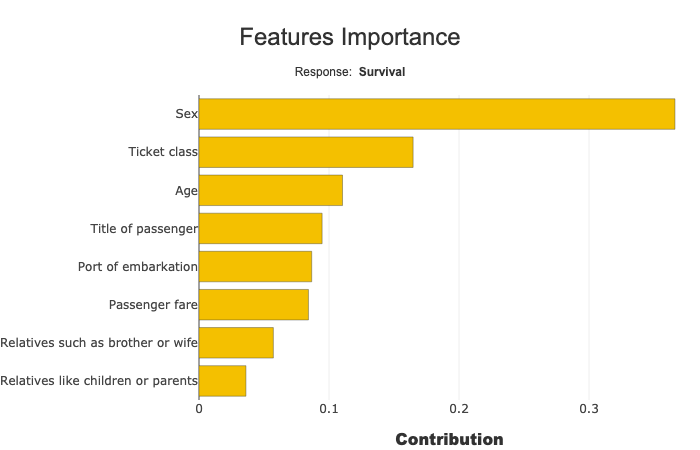
Multiclass: Select the target modality
Features importances sum and display the absolute contribution for one target modality. you can change this modality, selecting with label parameter:
xpl.plot.features_importance(label=‘Death’)
with label parameter you can specify target value, label or number
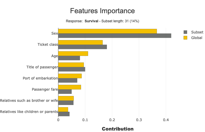
Focus and compare a subset
selection parameter specify the subset:
[12]:
sel = [581, 610, 524, 636, 298, 420, 568, 817, 363, 557,
       486, 252, 390, 505, 16, 290, 611, 148, 438, 23, 810,
       875, 206, 836, 143, 843, 436, 701, 681, 67, 10]
[13]:
xpl.plot.features_importance(selection=sel)
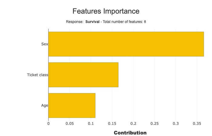
Tune the number of features to display
Use max_features parameter (default value: 20)
[14]:
xpl.plot.features_importance(max_features=3)
Understand local effect
This plot allows us to observe how the importance of features varies across different subpopulations. For instance, we can see that in certain subpopulations, the Port of Embarkation has a greater impact than the Ticket Class, highlighting the local variations in feature significance.
[15]:
xpl.plot.features_importance(mode='global-local', max_features=10, zoom=True)
[15]:

In the plot below, we observe the same effect as before. For example, in certain subpopulations, the Port of Embarkation has a greater impact than the Ticket Class. This offers another way to visualize feature importance both locally and globally.
When the curves cross each other, it indicates that one feature has a higher local effect in a specific subpopulation, but a lower global impact across the entire dataset. On the other hand, if a curve consistently remains higher than another, it signifies that the feature is more important both globally and locally.
After this initial analysis, you can use the contribution plot to gain deeper insights into how a particular feature influences the model’s predictions.
[16]:
xpl.plot.features_importance(mode='cumulative', normalize_by_nb_samples=True, degree=-0.7, zoom=True)
[16]:
