Contributions comparing plot
compare_plot is a method that displays scatter plot of contributions of several individuals. The purpose of these representations is to understand where the difference of predictions of several indivuals stems from.
This tutorial presents the different parameters you can use in compare_plot to tune output.
Contents: - Loading dataset and fitting a model.
Regression case: Specify the target modality to display.
Input parameters
Classification case
Data from Kaggle: House Prices
[1]:
import pandas as pd
from catboost import CatBoostRegressor
from sklearn.model_selection import train_test_split
Building Supervized Model
First Step : Load house prices data
[2]:
from shapash.data.data_loader import data_loading
house_df, house_dict = data_loading('house_prices')
y_df = house_df['SalePrice'].to_frame()
X_df = house_df[house_df.columns.difference(['SalePrice'])]
[3]:
X_df.head()
[3]:
| 1stFlrSF | 2ndFlrSF | 3SsnPorch | BedroomAbvGr | BldgType | BsmtCond | BsmtExposure | BsmtFinSF1 | BsmtFinSF2 | BsmtFinType1 | ... | SaleType | ScreenPorch | Street | TotRmsAbvGrd | TotalBsmtSF | Utilities | WoodDeckSF | YearBuilt | YearRemodAdd | YrSold | |
|---|---|---|---|---|---|---|---|---|---|---|---|---|---|---|---|---|---|---|---|---|---|
| Id | |||||||||||||||||||||
| 1 | 856 | 854 | 0 | 3 | Single-family Detached | Typical - slight dampness allowed | No Exposure/No Basement | 706 | 0 | Good Living Quarters | ... | Warranty Deed - Conventional | 0 | Paved | 8 | 856 | All public Utilities (E,G,W,& S) | 0 | 2003 | 2003 | 2008 |
| 2 | 1262 | 0 | 0 | 3 | Single-family Detached | Typical - slight dampness allowed | Good Exposure | 978 | 0 | Average Living Quarters | ... | Warranty Deed - Conventional | 0 | Paved | 6 | 1262 | All public Utilities (E,G,W,& S) | 298 | 1976 | 1976 | 2007 |
| 3 | 920 | 866 | 0 | 3 | Single-family Detached | Typical - slight dampness allowed | Mimimum Exposure | 486 | 0 | Good Living Quarters | ... | Warranty Deed - Conventional | 0 | Paved | 6 | 920 | All public Utilities (E,G,W,& S) | 0 | 2001 | 2002 | 2008 |
| 4 | 961 | 756 | 0 | 3 | Single-family Detached | Good | No Exposure/No Basement | 216 | 0 | Average Living Quarters | ... | Warranty Deed - Conventional | 0 | Paved | 7 | 756 | All public Utilities (E,G,W,& S) | 0 | 1915 | 1970 | 2006 |
| 5 | 1145 | 1053 | 0 | 4 | Single-family Detached | Typical - slight dampness allowed | Average Exposure | 655 | 0 | Good Living Quarters | ... | Warranty Deed - Conventional | 0 | Paved | 9 | 1145 | All public Utilities (E,G,W,& S) | 192 | 2000 | 2000 | 2008 |
5 rows × 72 columns
Second step : Encode the categorical variables
[4]:
from category_encoders import OrdinalEncoder

categorical_features = [col for col in X_df.columns if X_df[col].dtype == 'object']

encoder = OrdinalEncoder(
    cols=categorical_features,
    handle_unknown='ignore',
    return_df=True).fit(X_df)

X_df = encoder.transform(X_df)
Regression case
Third step : Get your dataset ready and fit your model
[5]:
Xtrain, Xtest, ytrain, ytest = train_test_split(X_df, y_df, train_size=0.75, random_state=1)
[6]:
regressor = CatBoostRegressor(n_estimators=50).fit(Xtrain, ytrain, verbose=False)
[7]:
y_pred = pd.DataFrame(regressor.predict(Xtest), columns=['pred'], index=Xtest.index)
Declare and compile your SmartExplainer explainer
[8]:
from shapash import SmartExplainer
[9]:
xpl = SmartExplainer(
    model=regressor,
    preprocessing=encoder, # Optional: compile step can use inverse_transform method
    features_dict=house_dict  # Optional parameter, dict specifies label for features name
)
[10]:
house_dict['MSZoning']
[10]:
'General zoning classification'
[11]:
xpl.compile(
    x=Xtest,
    y_pred=y_pred # Optional
)
Backend: Shap TreeExplainer
Compare_plot
Now that your explainer is ready, you can use the compare_plot to understand how two (or more) individuals are different.
For example, if you want to compare the first two individuals of the Xtest dataset, you have several ways to do it :
you can use the
row_numparameter by usingrow_num = [0, 1]You can also directly use the indexes, by
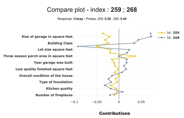
index = [Xtest.index[0], Xtest.index[1]]You can also use directly the index numbers :
index = [259, 268]
The result of each the methods above is the same :
[12]:
xpl.plot.compare_plot(index=[Xtest.index[0], Xtest.index[1]])
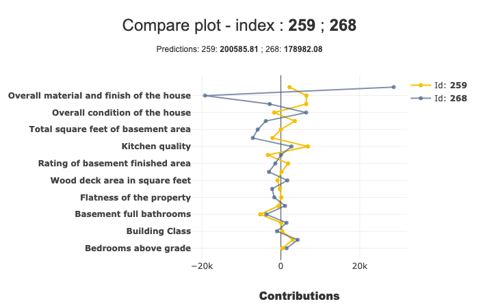
In this example, we can see that the ‘Ground living area square feet’ contributes a lot more for Id 268 than Id 259.
We can see more details of a specific point on hover.
Number of features displayed
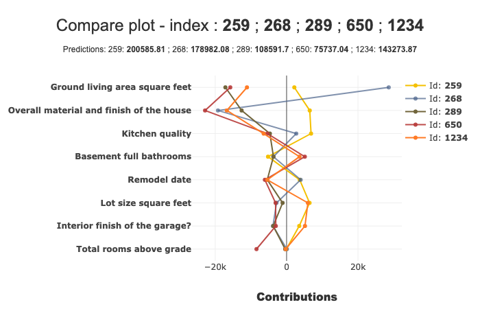
By default, the number of features displayed by the compare_plot is 20. You can modify it with the max_features parameter. You can also compare more than 2 individuals:
[13]:
xpl.plot.compare_plot(row_num=[0, 1, 2, 3, 4], max_features=8)
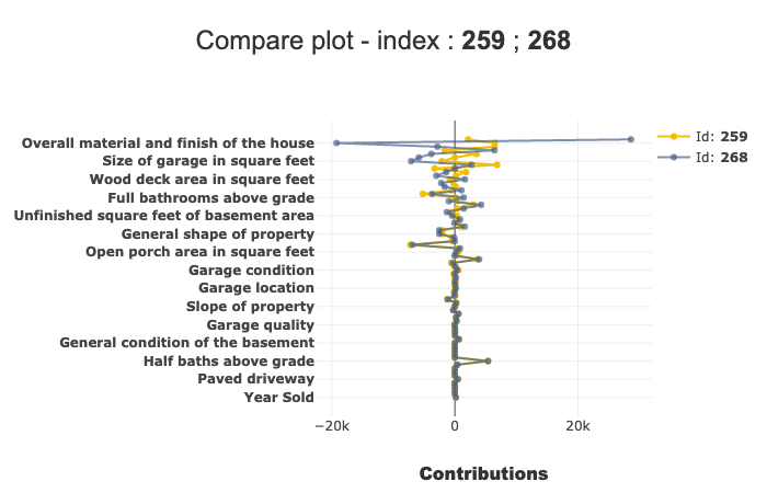
You can also decide whether or not showing the prediction in subtitle, with the show_predict parameter.
[14]:
xpl.plot.compare_plot(row_num=[0, 1], show_predict=False, max_features=100)
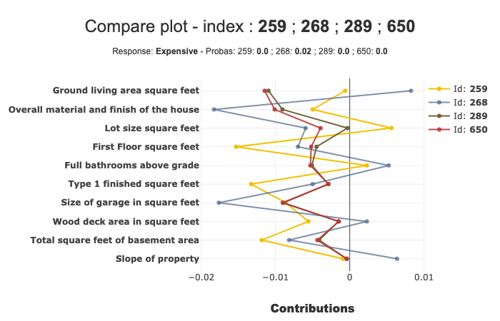
Classification case
Transform our use case into classification:
[15]:
from sklearn.ensemble import RandomForestClassifier
[16]:
ytrain['PriceClass'] = ytrain['SalePrice'].apply(lambda x: 1 if x < 150000 else (3 if x > 300000 else 2))
label_dict = { 1 : 'Cheap', 2 : 'Moderately Expensive', 3 : 'Expensive' }
[17]:
clf = RandomForestClassifier(n_estimators=50).fit(Xtrain,ytrain['PriceClass'])
y_pred_clf = pd.DataFrame(clf.predict(Xtest), columns=['pred'], index=Xtest.index)
Declare new SmartExplainer dedicated to classification problem
[18]:
xplclf = SmartExplainer(
    model=clf,
    preprocessing=encoder,
    features_dict=house_dict,
    label_dict=label_dict      # Optional parameters: display explicit output
)
[19]:
xplclf.compile(
    x=Xtest,
    y_pred=y_pred_clf
)
Backend: Shap TreeExplainer
Use label parameter of compare_plot parameter to select the explanation you want
with label parameter, you can specify explicit label or label number.
[20]:
xplclf.plot.compare_plot(row_num=[0, 1], label=1) # Equivalent to label = 'Cheap'
By default, if label parameter isn’t mentioned, the last label will be used.
[21]:
xplclf.plot.compare_plot(row_num=[0, 1, 2, 3], max_features=10)