scatter_plot_prediction
scatter_plot_prediction is a method that displays violin or scatter plot. The purpose of these representations is to visualise correct or wrong prediction Provide the y_target argument in the compile() method to display this plot
This tutorial presents the different parameters you can use in scatter_plot_prediction to tune output, and results on classification and regression models
Contents: - Building a classification model - Building a regression model - Display scatter plot prediction - Focus on a subset - Size of Random Sample
Data from Kaggle Titanic for classification Data from Kaggle House Prices for regression
[36]:
from xgboost import XGBClassifier
from catboost import CatBoostRegressor
from sklearn.model_selection import train_test_split
Building Supervized Model for Classification and compute Shapash
[37]:
from shapash.data.data_loader import data_loading
titanic_df, titanic_dict = data_loading('titanic')
y_df=titanic_df['Survived'].to_frame()
X_df=titanic_df[titanic_df.columns.difference(['Survived'])]
[38]:
from category_encoders import OrdinalEncoder

categorical_features = [col for col in X_df.columns if X_df[col].dtype == 'object']

encoder = OrdinalEncoder(
    cols=categorical_features,
    handle_unknown='ignore',
    return_df=True).fit(X_df)

X_df=encoder.transform(X_df)

Xtrain, Xtest, ytrain, ytest = train_test_split(X_df, y_df, train_size=0.75, random_state=7)
[39]:
clf = XGBClassifier(n_estimators=200,min_child_weight=2).fit(Xtrain,ytrain)
First step: You need to Declare and Compile SmartExplainer
[40]:
from shapash import SmartExplainer
[41]:
response_dict = {0: 'Death', 1:' Survival'}
[42]:
xpl_classifier = SmartExplainer(
    model=clf,
    preprocessing=encoder, # Optional: compile step can use inverse_transform method
    features_dict=titanic_dict, # Optional parameters
    label_dict=response_dict    # Optional parameters, dicts specify labels
)
To display scatter_plot_prediction, you have to fill “y_target”
[43]:
xpl_classifier.compile(x=Xtest,
            y_target=ytest
            )
INFO: Shap explainer type - <shap.explainers._tree.TreeExplainer object at 0x11d02fdc0>
Building Supervized Model for Regression and compute Shapash
[44]:
from shapash.data.data_loader import data_loading
house_df, house_dict = data_loading('house_prices')
y_df=house_df['SalePrice'].to_frame()
X_df=house_df[house_df.columns.difference(['SalePrice'])]
[45]:
from category_encoders import OrdinalEncoder

categorical_features = [col for col in X_df.columns if X_df[col].dtype == 'object']

encoder = OrdinalEncoder(
    cols=categorical_features,
    handle_unknown='ignore',
    return_df=True).fit(X_df)

X_df=encoder.transform(X_df)

Xtrain, Xtest, ytrain, ytest = train_test_split(X_df, y_df, train_size=0.75, random_state=1)
[46]:
regressor = CatBoostRegressor(n_estimators=50).fit(Xtrain,ytrain,verbose=False)
First step: You need to Declare and Compile SmartExplainer
[47]:
xpl_regressor = SmartExplainer(
    model=regressor,
    preprocessing=encoder, # Optional: compile step can use inverse_transform method
    features_dict=house_dict, # Optional parameter, dict specifies label for features name
)
To display scatter_plot_prediction, you have to fill “y_target”
[48]:
xpl_regressor.compile(x=Xtest,
            y_target=ytest
           )
INFO: Shap explainer type - <shap.explainers._tree.TreeExplainer object at 0x11b218040>
Display scatter plot prediction
[49]:
from IPython.display import Image
[ ]:
xpl_classifier.plot.scatter_plot_prediction()
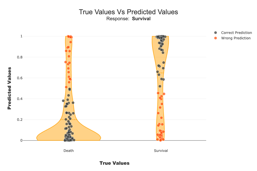
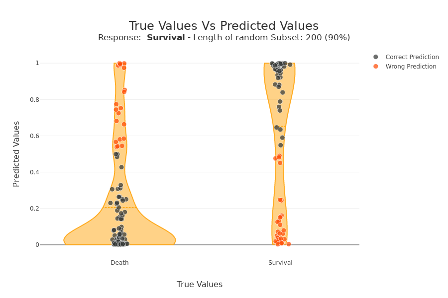
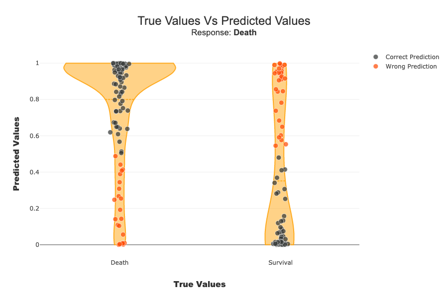
On the x-axis we have the actual class of samples. On the y-axis we have the probability of the classifier belonging to the default class (Survival in this case). For a binary classification, we find a sort of confusion matrix with the true negatives at the bottom left. On the top right, the true positives. On the top left, the false negatives. Bottom right, false positives. The violin plot represents the distribution of all the samples.
[ ]:
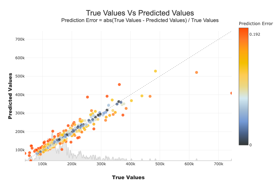
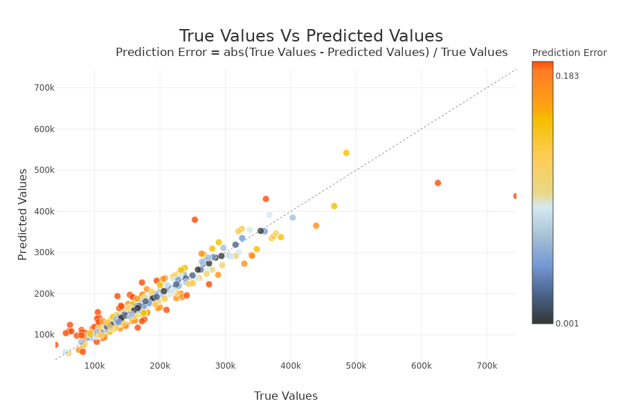
xpl_regressor.plot.scatter_plot_prediction()

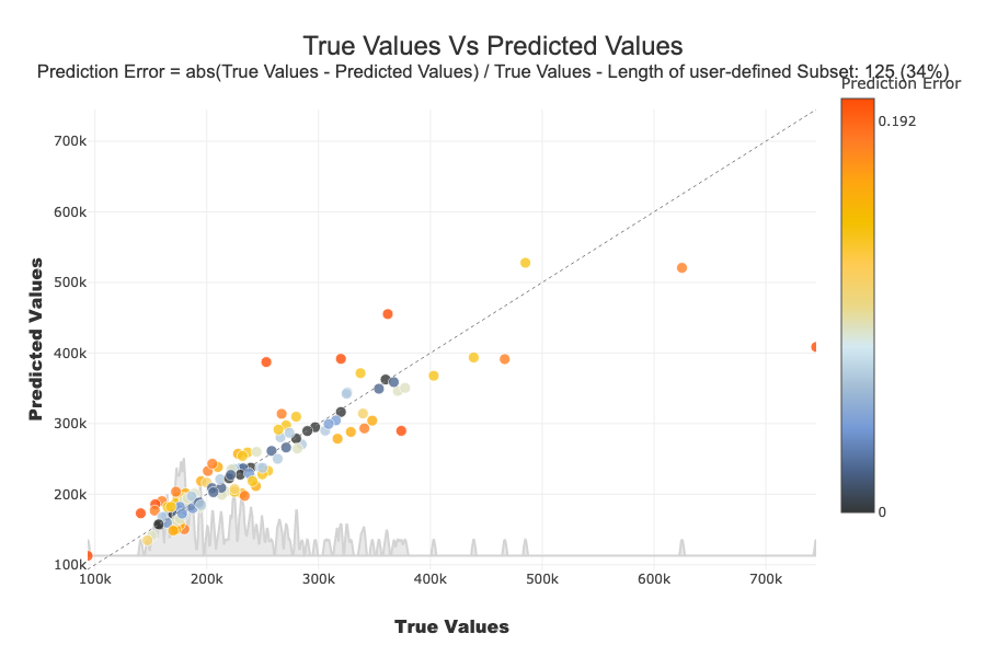
On the x-axis we have the actual values of samples. On the y-axis we have the predicted values. If a point is on the y = x line and is blue, then the prediction error is low. The further a point deviates from this line and is red, the higher the prediction error. If there are no true values (y_target) at 0 as in this use case, the prediction error is calculated as follows : \(Prediction Error = abs(True Values - Predicted Values) / True Values\) Else \(Prediction Error = abs(True Values - Predicted Values)\)
[ ]:
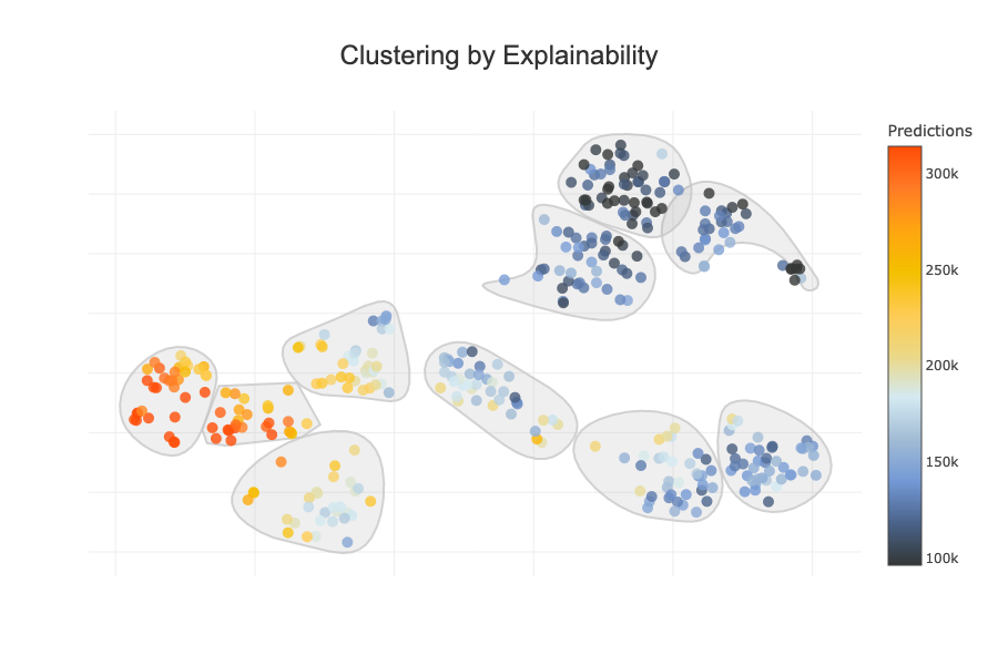
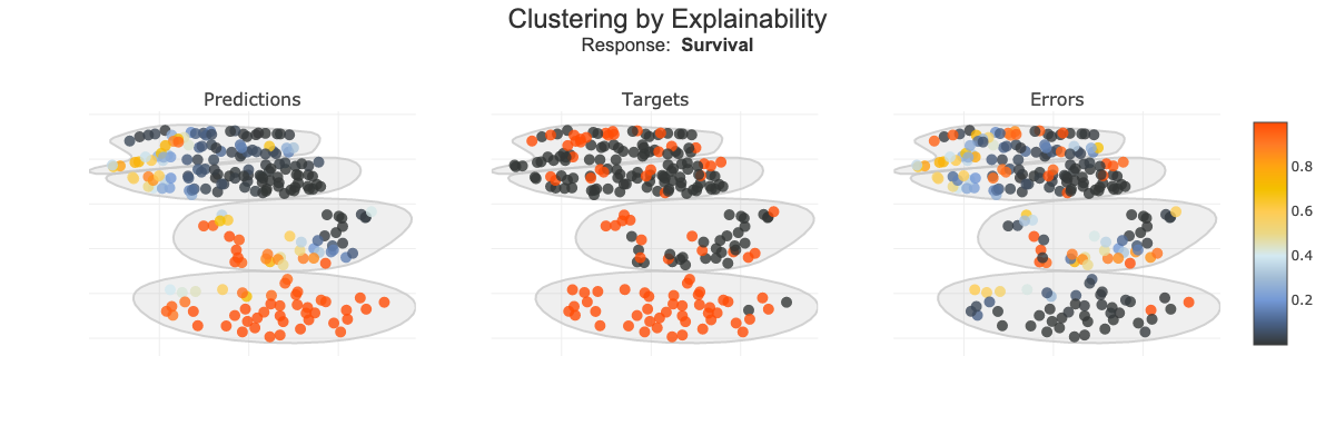
xpl_regressor.plot.clustering_by_explainability_plot(color_value="predictions")
[ ]:
xpl_regressor.plot.clustering_by_explainability_plot(color_value="errors")
Focus on a subset
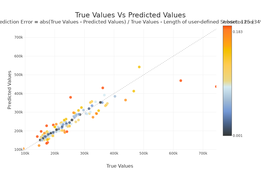
With selection params you can specify a list of index of people you wand to focus
[54]:
index = list(Xtest[xpl_regressor.x_init['YearBuilt'] > 1990].index.values)
[ ]:
xpl_regressor.plot.scatter_plot_prediction(selection=index, width=900, height=600)
[ ]:
xpl_regressor.plot.clustering_by_explainability_plot(selection=index, color_value="predictions", n_clusters=8)
with label parameter, you can specify explicit label or label number Very useful for multiclass.
[ ]:
xpl_classifier.plot.scatter_plot_prediction(label='Death')
[ ]:
xpl_classifier.plot.clustering_by_explainability_plot(color_value=["predictions","targets","errors"], width=1200, height=800, n_clusters=4)
Size of Random Sample
Method plot.scatter_plot_prediction use random sample to limit the number of points displayed. Default size of this sample is 2000, but you can change it with the parameter max_points:
[ ]:
xpl_classifier.plot.scatter_plot_prediction(max_points=200)
Add y_target after compile
If the compile() took a long time and you forgot to fill in y_target, you can also add it with the add method
[60]:
xpl_regressor = SmartExplainer(
    model=regressor,
    preprocessing=encoder, # Optional: compile step can use inverse_transform method
    features_dict=house_dict, # Optional parameter, dict specifies label for features name
)
[61]:
xpl_regressor.compile(x=Xtest,
            #y_target=ytest
           )
INFO: Shap explainer type - <shap.explainers._tree.TreeExplainer object at 0x11d4f7d30>
[62]:
xpl_regressor.add(y_target=ytest)
[ ]:
xpl_regressor.plot.scatter_plot_prediction()